Showing posts with label comic visuals. Show all posts

Wednesday, June 13, 2012

Comic books and the impossible woman: people still don't get it

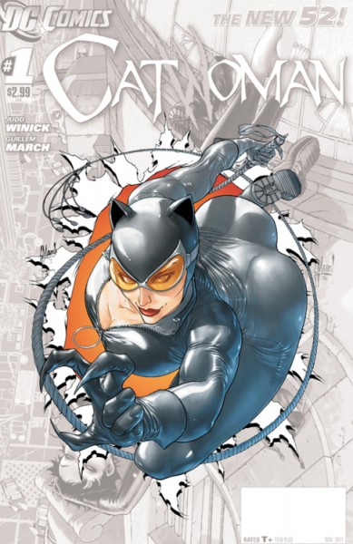
So, in the past few days, this picture of Catwoman has sparked a veritable shit-storm on the internet:

Catwoman #0, cover by Guillem March.

There's a lot to dislike, here, if you care even a bit about anatomy. (And since Catwoman's abilities do not involve the reshaping of her body to fit her whim, the "it's fantasy!" argument really doesn't hold water.) Her breast plate appears to be angled outward and upward(?!), which, given the position of her tailbone, would mean that her spine is bending at something like a 50 degree angle. And bending in the wrong place. And her abdomen is about 3 feet long. (Let's not even talk about how it's being simultaneously twisted, though.) I suppose that's theoretically do-able - gymnasts can certainly bend backward - but not under these circumstances. Catwoman's legs, arms, and neck are moving against the curve of her spine, whereas the gymnasts entire body needs to contributing to make it work. The movement of her jump doesn't make sense, either - she's leaping forward into space, but her body would have to be arcing backward for this to be even slightly plausible. And to make matters worse, if you were to map out the structure of her shoulders and collar bone, you'd need to conclude that her neck is actually popping out of left shoulder. (Well, either that or her head has been dislocated from her neck. Which is possible, because the angle of her face looks wrong, too.)

But perhaps surprisingly, the frothy-mouthed barking has not come from people who hate the cover. It's come, instead, from the people defending it.

Let me back up a bit, though. There have been critics of the cover, of course. But, y'see, one only has so much energy and disbelief to devote to these things when this is probably only one of a dozen gratuitous and impossible T&A comic book covers that will grace shelves this month. Which is why most of the responses - and this has been true of most comic art since Escher Girls was created, at least - have involved gently, and hilariously, mocking and parodying the image. And, in some cases, even correcting it. (Click those links. They're pretty great.)

But about the anger - this reaction, written by Jason Kerouac, to the re-draws and critiques appeared yesterday. And he's not at all happy that people are criticizing the cover. (He begins with "Grow the fuck up", so you know he means business.)

He suggests that the pose is plausible, but he's wrong and his photo comparisons aren't even close. He also suggests that it doesn't matter because it's art - money quote: "Y’know who else exaggerated anatomy? Picasso" - but ignores the fact that this artist is actually a realist, and some basic rules do apply. And he makes the classic recourse to reverse-sexism, arguing that men are exaggerated and sexualized, too. Except that they're not, really - idealized, yes, but there's no male equivalent to the fetishization of double-D breasts, peeking through rubber-catsuit cleavage. (Centuries of sexism and the resulting imbalance of representational power will do that.) So, he provides a lot of arguments, but they don't work so well together - he plays both the realism and surrealism cards, which is weird - and none of them work separately, either.

Part of the problem, I think, is that he doesn't seem to really understand why people dislike the cover. He thinks that the response has to do with anatomy, with Catwoman being a poor role-model, and with being a "cool kid" who can poke fun. And it might have something to do with each these. But what these reactions are really responding to misogyny - to a comics industry that still can't see why a female superhero or supervillain is worth reading unless her tits and ass are magically detaching from her body and flinging themselves at you - the 90% male readership of super-hero comics - while you read about them.

Did I say "them"? Sorry, I meant "read about her".

Tuesday, September 27, 2011

The DC relaunch: some reactions

1) DC Comics made waves - of the bad kind - in July when their co-publisher, Dan DiDio, got in an argument with a fan at Comicon. The fan had a legitimate beef: DC was canceling and relaunching all 52 comics in their superhero line, and in so doing was slashing their compliment of women from double-digits to just 2. And if this wasn't problematic enough, DiDio decided to chew the fan out, questioning whether it made a meaningful difference and demanding that the fan tell DiDio who they should have hired. It reflected pretty poorly on DC, especially given that women, in comics, have always been underrepresented as creators and problematically sexualized as characters.

2) I've picked up only two comics from the relaunch, including the very first one, the flagship Justice League title from Geoff Johns and Jim Lee, and Grant Morrison's Action Comics. (Though I've seen a lot of reviews and responses to other comics - but more on that later.) I don't know what the objective is with these new comics, but it seems to me that DC has actually rid itself of two of the things that gave its universe a unique character among the various superhero worlds - an optimistic outlook and bigger-than-big powers. Especially in relation to Marvel - where the world order is always tenuous, the situation is always dire, and the (anti-)heroes unliked and over-matched - DC has always seemed bright and bubbly. So, at least according to this guy's initial assessment, the newly brooding and irascible DC universe looks a whole lot like Marvel's. And this isn't a good thing.

3) In the past week, though, all of the attention has shifted back to the sorts of concerns that were, at least implicitly, being voiced back in July. Specifically, it's these comics, Red Hood and the Outsiders and Catwoman:


Now, admittedly, these are just small portions of bigger comics. But they're also pretty fair representations of the whole from which they've been taken. And they also seem to offer good evidence that the jokes that non-comic folks make - y'know, about superhero comics being filled with T&A and comic readers being horny fanboys - are well-founded. So rather than completely stealing someone else's thunder, I'll post some good quotes and refer you to the source - it`s worth reading it all:
"Most problematically, we are shown [Catwoman's] breasts and her body over and over for two pages, but NOT her face. [...] Can't you show us the playful or confident look in her eye as she puts on her sexy costume? Because without that it's impossible to connect with the character on any other level than a boner, and I'm afraid I don't have one of those."

"If you really want to support Starfire's 'liberated sexuality' like she's somehow a person with real agency, what people should really be campaigning for is more half-clothed dudes in suggestive poses to get drawn around her, since I'm sure that's what she'd like to see. But people don't really want that, do they? Because it's not about what Starfire wants. It's about what straight male readers want. [...] but let's be honest about what's happening and who we're serving (or not serving) and at whose expense."

Thursday, September 17, 2009

The cover to Batman and Robin 3

This blog entry has nothing to do with the comic itself and everything to do with how good Frank Quitely is.

Take a look at the cover to Batman and Robin #3:


Pretty nifty, eh? All these trippy colors, a bunch of scary hands in the foreground and a bunch of Dollotrons for Batman and Robin to POW! PAFF! and BOP! (The SCT and BANG made of blood in the hospital scene? A perfect demonstration of Quitely's ability to adapt the TV show's aesthetic to the new title.) I did, however, wonder why two of the baddies seemed to be looking backward - looking at us, maybe? Looking at Professor Pyg? But that wouldn't make sense because he didn't wear those gloves. Weird.

But I put it down on my desk and when I came back the cover was upside down. Not only did I notice some now conspicuous design choices, but those two backward glancing characters made sense - because the cover is actually face:


The faces are eyeballs, the logo is a maniacal grin, and the white gloves a face, with Batman, Robin, and the throng in the background being a nose, of sorts. And those conspicuous details that now make sense? Well, green and purple can't possibly be random choices. And there's also a curious green glow on the thumbs of a Dollotron in the foreground - cast on them from the background, I guess, though it doesn't make physical sense. More likely it's a purely aesthetic choice, and when we reverse the cover it suggests green eyebrows for this face.

And the owner of that face: can it possibly belong to anyone other than the Joker? Very cool.

Sunday, September 23, 2007

TCAF follow-up: "The Luxury of Living"

I never followed-up on the books that I picked up at the Toronto Comic Arts Festival, so I'll write about one today and another in the next day or two. (Since committing to blogging tomorrow is never a good idea.)

The first is one toward which I feel rather ambivalent - Michael Noonan's "The Luxury of Living". I'll start with a brief comment on the visuals, toward which I feel absolutely no ambivalence. Noonan's pencils remind me of David Mazzucchelli, which is no small compliment. I don't know if it's that Noonan's lines seem somewhat scratchier than Mazzucchelli's, or that the directness of his prose - while the entire piece is a letter, of sorts, he occasionally speaks directly to the reader - is creating the connection in my brain, but I'm also reminded of "Waking Life" aesthetic. And so Noonan's carefully composed line-work, seeming to barely contain the anxiety that creeps out through those lines and that's likewise expressed in his text, appears to shake and undulate as if a part of that (equally anxious, paranoid) film. (One minor problem? The computer-typed text - it has the opposite effect, given that it is clean and uniform, often ill-fitting, sometimes misspelled, and simply disruptive of the experience.)

Of course, "Waking Life" is something of a precocious and precious film - and so too is
"The Luxury of Living". The book is, in almost equal parts it would seem, an expression of love for his daughter and disgust for his ex-wife. And this is something of a problem, as the latter seems to necessarily drain some of the sincerity from the former. I don't doubt Noonan's emotions, but the comic seems to be implicated in the custody battle that Noonan describes - it makes for a problematic and discomforting experience. It feels as if this if the daughter herself is secondary to striking back at charges that he's the poorer parent. And arguing that, in fact, the reverse is the case.

Well intentioned as he might have been, Noonan's book feels like a thinly-veiled attempt to drag his daughter into the fight, though indirectly. And whether he's totally conscious of the book's instrumentalism, he at least acknowledges his inability to keep her entirely sheltered from the fighting. In the book's first short narrative, Noonan argues with his ex-wife's boyfriend over the phone. He checks on his sleeping daughter afterward, hoping that she hasn't overheard. Satisfied that she's asleep, he closes the door - and her eyes open.

Tuesday, July 03, 2007

On comic art and artists: Visual prose and poetry

My visual comic book sensibilities seem to be very realist, I think - or at least highly conventional. My favorite story tellers - that is, the pencillers and penciller/inkers - are distinctly linear and clearly organized in their style.

For instance, John Cassaday's style is very romantic - high contrast and deep shadows (or negative space) that draw your eye to the character in the foreground (who is often almost bursting from the panel), and he sometimes duplicates panels (either literally or in a visual approximation) to indicate beats in a way that lends his work a certain rhythmic and cinematic quality. Though still an undeniably linear (or at least not unlinear) rhythm.

Note below, for instance, the absence of a distracting background in the first panel and the way that the indistinct light source make's the villainous Ord's face look hard and dangerous. The jump from first to second panel seems dramatic, but it's anticipated by the previous page (where Ord is running through a hallway while he knocks soldiers aside) and so the inference is an easy one. It also makes it clear that Cassaday considers the actual run to be of little dramatic consequence. He wants us to see Ord's eyes, and then the fantastical escape itself, which seems to be frozen in time, or at least in very slow motion. The two panels at the bottom have a kind of visual repetition insofar as Cassaday very deliberately wants us to know how Ord escapes - we can't intuit his finding a ship and stealing it as easily as we can his jumping out a window, so he walks us through it very deliberately.

Frank Quitely may seem like a curious pairing with Cassaday - insofar as his overly detailed line-work sometimes borders on the absurd or grotesque, and his absence of Cassaday-like attention to light sources heightens our awareness that this is, in fact, a cartoon - but their organization is still deceivingly simple, as he likewise employs obvious focal points, tight and accessible visual arrangements, and clear narrative panel progressions.

The first page of All-Star Superman is an exaggerated example - this is Quitely at his most self-consciously mythic and grand - but I think it does well to speak to how overwhelming and lush his visuals can be, while at the same time there is never any doubt as to where and how our eyes should be moving through them. We might return later to see if we missed something, but those subsequent peeks never significantly alter the path of the story.


Which is just to bring me to Chris Bachalo, whose work, while resembling Quitely's in its detail and Cassaday's in his fondness for light and dark, is playing an entirely different ballgame. I like Bachalo's character design work, but I'm often left confused and anxious about his layouts and panels. Unlike the other two artists, Bachalo often balks at convention and doesn't lend his pictures any clear focal point. There is often no negative space (or the opposite - an overabundance of it) and so you might find yourself at first examining the most inconsequential bit of overly detailed debris in the foreground - simply because that's where your eye has been trained to go. Bachalo's stuff is often without rhythm, and so seems to resist linearity: you're caught in the panel, trying to figure your way out, and so time seems to freeze in an uncomfortable way. (Though, I suppose, this is more true of people who are less familiar with his work than others.)

In this two page spread, Bachalo takes it a step further by providing us with more than one narrative option for moving our eyes through the panels, each in contradiction to the other. One is distinctly linear - and the small panels and grid-arrangement make it much easier for us to read in this way - while the other jumps between the visual organization in an entirely different pattern, opening up a totally different experience. From a narrative standpoint, the scene almost has to play twice - we read it one way and then go back to read it the other - and attempting to marry the two never produces a wholly coherent result. We have to decide how we'll read the comic before we can even worry about, well, reading it.


This is not to say that I think that Bachalo's a worse or better artist, but to say that the vocabulary and rules he's playing with are themselves entirely different. I'm not as fond of Bachalo because I think that he often pushes too hard to be less accessible and experimental at the cost of the larger story's (that is, the visuals and text) ostensible goal, but it's clear that his approach deserves attention. If I were to be reductive (and, sure, I'm feeling that way), I'd propose that Cassaday and Quitely's pencils are prosaic, whereas Bachalo's is poetic. And while the latter is admirable, I also have to wonder if it can ever be as fully realized as the former in a 22 page booklet with its unavoidable physical limitations. Or, rather, maybe I feel like I'm still waiting to see such a thing to happen.